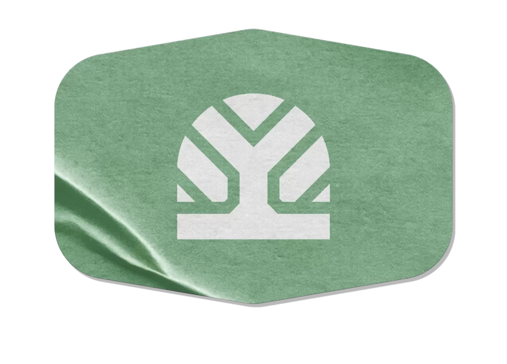
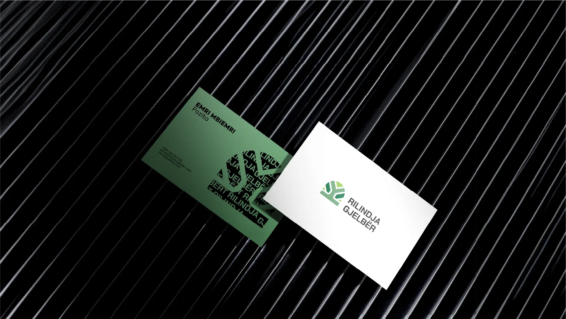
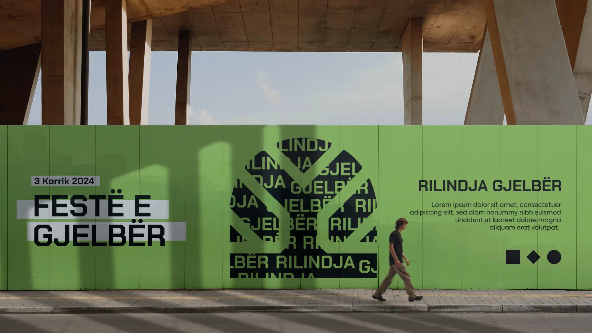
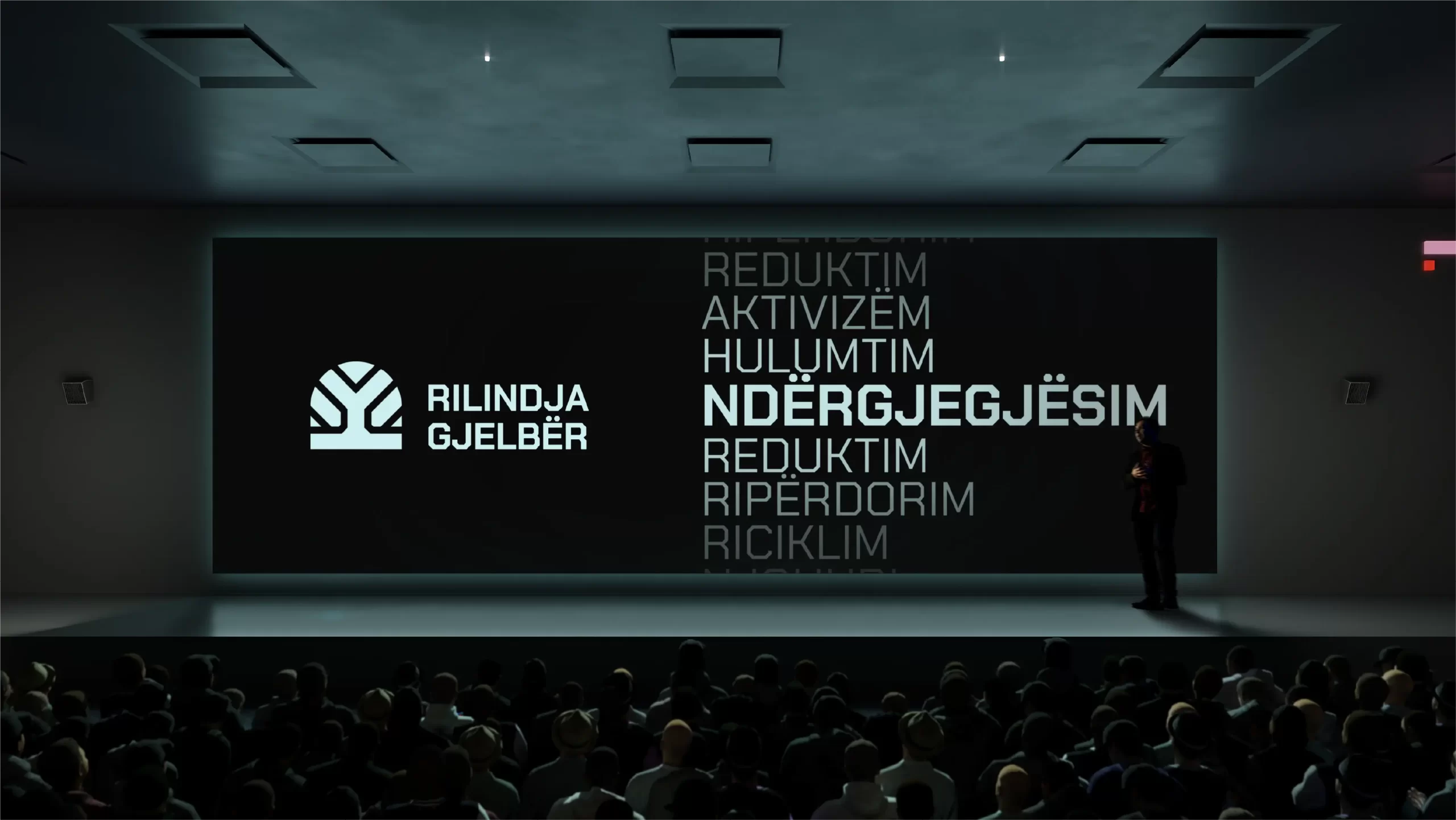
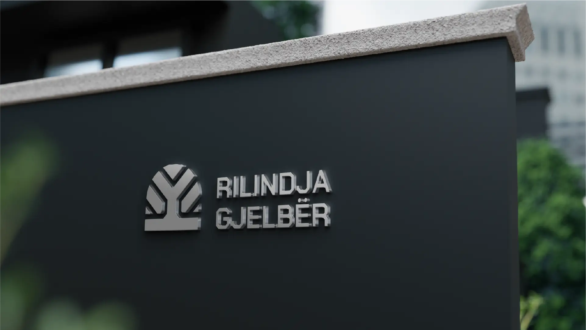
On the occasion of the tenth anniversary of the establishment, Let’s Do It Peja presents the new identity, which symbolizes our transformation and commitment to a greener future. The new identity – Rilindja Gjelbër features a sustainable tree, which represents our strong community base and our inseparable connection with nature. The tree in our logo symbolizes a man standing proudly with his hands raised, representing the power and unity of people in their efforts for a cleaner and more sustainable environment.
The circle above the tree symbolizes the continuous cycle of life and rebirth, while the branches of the tree reflect diversity and growth. This symbol shows that everything originates from earth, trees, air and water – basic elements for life. Our renaissance stems from the power of nature and the commitment of people to preserve it.


The primary color will be green because of the main focus of the organization, the other color will be black, up to the shade of white because of the seriousness of the company. The auxiliary colors will be organic colors from the most diverse, which will fit the new Brand of the organization due to its focus.
© Habitat. All rights reserved.
Prishtina, Kosovo